Friday, December 22, 2006
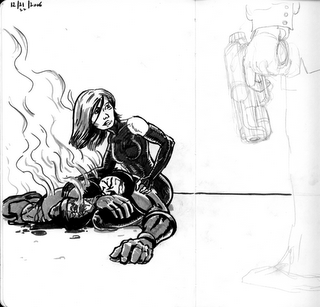
Study: Yukito Kishiro
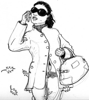
Copied a drawing of John Farrell, a character from the latest installment of Yukito Kishiro's Battle Angel Alita: Last Order. This was a study to see if by looking at and copying other artists lines I could get a better feel for how to approach my own line work. This was useful I think. I will do another one tomorrow. (Used a crow-quill nib, ink pen for the blacks.)
bush leagues
The alternate title to this post is "crap on a cracker". I am sort of frustrated with my lack of talent - everything looks so rushed and sloppy (especially after I go over the pencil with the inkpen). GAH!! The next few drawings I am going to do are copies of drawings that I think are good. maybe I can learn something about linework by studying and copying artists who know what the hell they're doing.
Saturday, December 16, 2006
practicing composition and scene openers
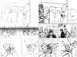
I was looking for something to draw the other night while watching the 40-year old virgin on HBO. There is a scene where the characters are at a japanese exhibition steakhouse and the waitresses are singing happy birthday to one of the people at the table. I thought that would be fun to draw for practice. The things I am trying to practice here are establishing a scene / location and setting an interesting composition for the panels and the page. For this I thought I would use two panels: one an establishing shot and a second shot of the main characters in the scene. That's it.
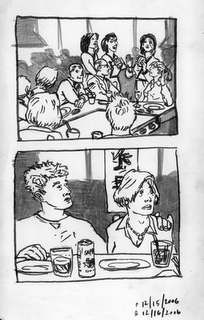
I think the setting is sort of clear....maybe not. It looks like a restaurant or bar at least - but could be a hotel conference room / wedding reception. the three people at standing in the background are supposed to be waitresses singing to the table. This is not really clear either I guess. The two main characters are seated at the bottom of the panel with their backs facing the reader. The composition in the opening panel is ok to me in that I think the lines and different values, move the eye across the panel from the bottom left across the table and up to the waitresses faces. The composition is a little too busy though(packed with lines). Also, the two main characters of the scene are seated at the bottom of the panel (with the backs of their heads to the reader) They are basically lost in the panel to me which results in a situation where the reader gets to the second panel and doesn't realyl know that these two people were in the prior panel at all. I should've done something to bring more attention to them.
The drawing is ok - maybe a bit to skritchy-skratchy. That always happens when I rush through stuff. I used a PITT brush pen to ink and I am not unhappy with it. I just need more practice with inks and finishing. For the fine lines I have to hold the pen tip so light against the paper that I get some shakiness in the line. Also at times I rush the line work and the line weights come out looking too uniform. Still learning.
Thursday, November 30, 2006
Using the model for layouts
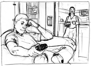
So I want to do a panel with Brett watching TV and Patrice in the background asking him if he wants some coffee. I zoom around with the model until I find the angle I want.
And then I can sketch the scene!
I think this could really help me think about layouts. Of course I still need to setup the perspective with vanishing points etc. for finished drawings but all the fretting about where they need to go is lessened. Kinda fun too.
And then I can sketch the scene!
I think this could really help me think about layouts. Of course I still need to setup the perspective with vanishing points etc. for finished drawings but all the fretting about where they need to go is lessened. Kinda fun too.
Tuesday, November 28, 2006
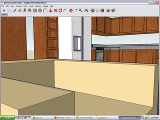
Patrice's Apartment from Google Sketchup
Cool little modelling app from google allows you to make a 3d model and then view it from any angle. Also has a ton of models others have built for reference. This could be helpful for seeing in perspective.
Here is a model I made for Patrice's apartment.
Another angle looking at the living-room area from the kitchen counter.
And another one looking back at the kitchen from the sitting area.
Also here is a model someone else did of Jerry Seinfeld's apt.
Here is a model I made for Patrice's apartment.
Another angle looking at the living-room area from the kitchen counter.
And another one looking back at the kitchen from the sitting area.
Also here is a model someone else did of Jerry Seinfeld's apt.
Friday, November 24, 2006
post buzz brett
Thursday, November 23, 2006
Wednesday, November 22, 2006
Friday, November 17, 2006
Thursday, November 16, 2006
pony tail
Wednesday, November 15, 2006
another sketch
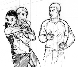
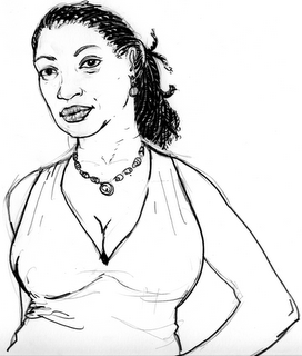
This drawing doesn't look good to me but it served it's purpose. I am basically trying to work out the body proportions and I think I am closing in on what I want. Also I think I am getting a handle on Patrice's basic look. However, this drawing looks a little dumpy/sloppy for some reason. I think part of it is the pen I used tonight. anyway more later.
Tuesday, November 14, 2006
Wednesday, November 01, 2006
more lettering p 16
Monday, October 30, 2006
Saturday, October 28, 2006
Friday, October 27, 2006
Thursday, October 19, 2006
Wednesday, October 18, 2006
Tuesday, October 17, 2006
Monday, October 16, 2006
Thursday, October 12, 2006
Wednesday, October 11, 2006
Tuesday, October 10, 2006
Monday, October 09, 2006
page 15
Friday, October 06, 2006
How-to by Kazu
Here is a cool step-by-step of the process Kazu Kibuishi uses on his "Copper" strip. I especially like that he uses a "cheap flat-bed scanner" because, so do I.
Thursday, October 05, 2006
page 12-13 finishes
page 12 -13 inks completed. Looking good I think. Also, I posted this to the flickr set if you want to see all 13 inked pages.
Tuesday, September 26, 2006
Monday, September 25, 2006
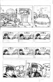
Process page 14 - rendering
Thursday, September 21, 2006
11 pages and counting
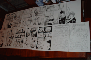
Photo set of the first 11 inked pages put up on flickr for sharing etc. I have pencils scanned for p12 (but not for 13) and am working on p 14 now. Moving right along. Anyway I was playing with various venues for posting/viewing this stuff and flickr seems pretty good. Tell me what you think - either here or there.
Wednesday, September 20, 2006
Process page 14 - sketch
Tuesday, September 19, 2006
Saturday, September 09, 2006
Darkness is Spreading!!!
Friday, September 08, 2006
Thursday, September 07, 2006
Bollocks!!
Tuesday, September 05, 2006
double page spread
Thursday, August 31, 2006
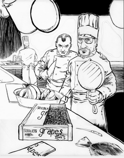
Chef Special
Tuesday, August 08, 2006
Sunday, January 29, 2006
pages from Hank's war
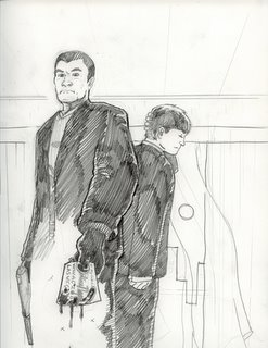
Last night I scanned in the old pencils and parital inks of the comic we did with April back in early 1997. We are close to the 10 year anniversary of this work. Also these are the first comic pages I ever did. The cover is an add-on I did a couple months ago after a cover from the Losers.
Hank's War
Hank's War
Subscribe to:
Posts (Atom)